

Did you know that Microsoft Excel has over 500 functions at your disposal? These functions make Microsoft Excel useful as an analytical tool for almost any industry. Marketers may not think of Excel as such, but Excel can be a super helpful tool to make their daily analysis of data simpler. Because nowadays, successful marketers need to work smart using relevant data. You simply cannot afford to focus your marketing effort in an area blindly and hope for the best.
In this post, I’ve compiled some Excel pro tips for marketers: the best excel features to make their job easier. Some of the tricks will make you appear professional, while others will improve your ability to analyze large amounts of data. Here are 7 Excel tricks that will improve your work life.
1. Freeze Panes
It is common for marketers to collect a lot of data per day for analysis. By the end of the week, you have so much data that your spreadsheet is long. It can be tough to read out headers when a spreadsheet is long since the headers disappear after a few columns. Therein lays the problem, especially when you are doing a presentation to potential clients.
Freezing panes can be a solution here. You can freeze the first row so that you will be able to see what each column represents. It also makes it easier to explain your data during a meeting without frequent scrolling up and down.
Here’s how to freeze panes in Excel:
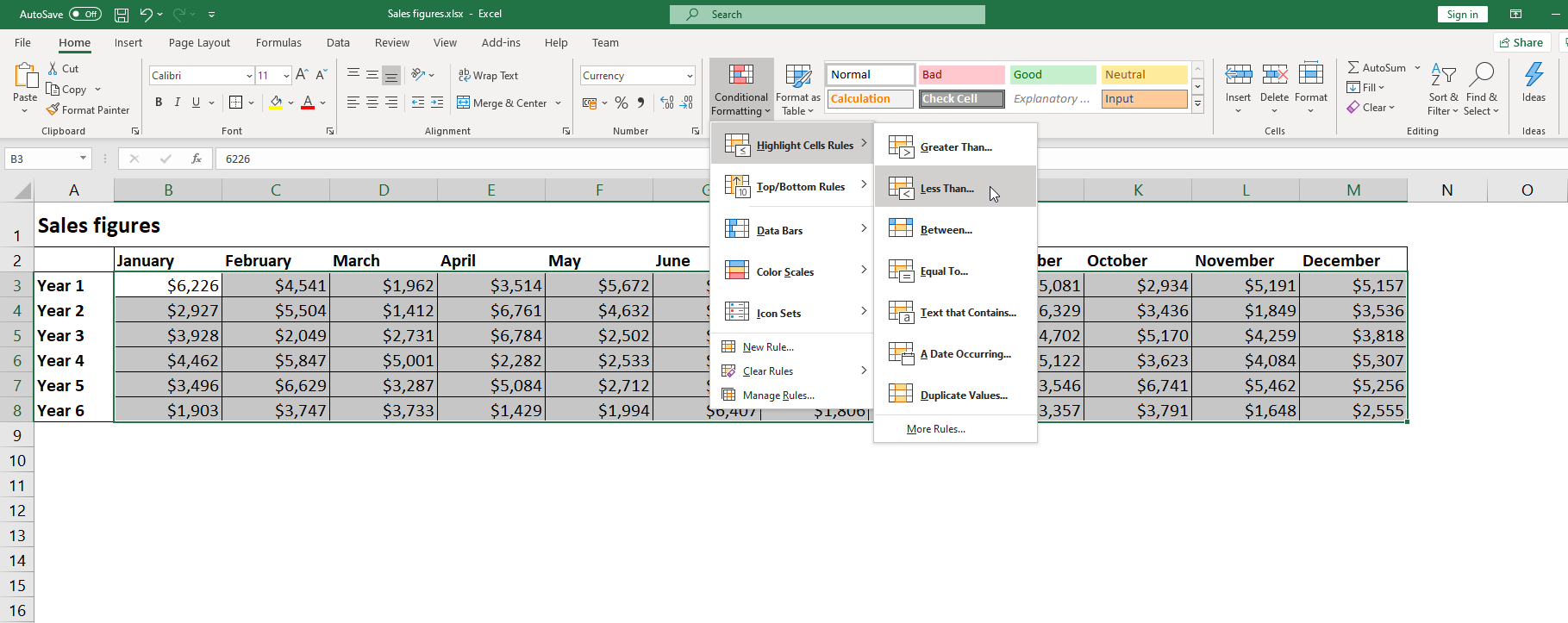
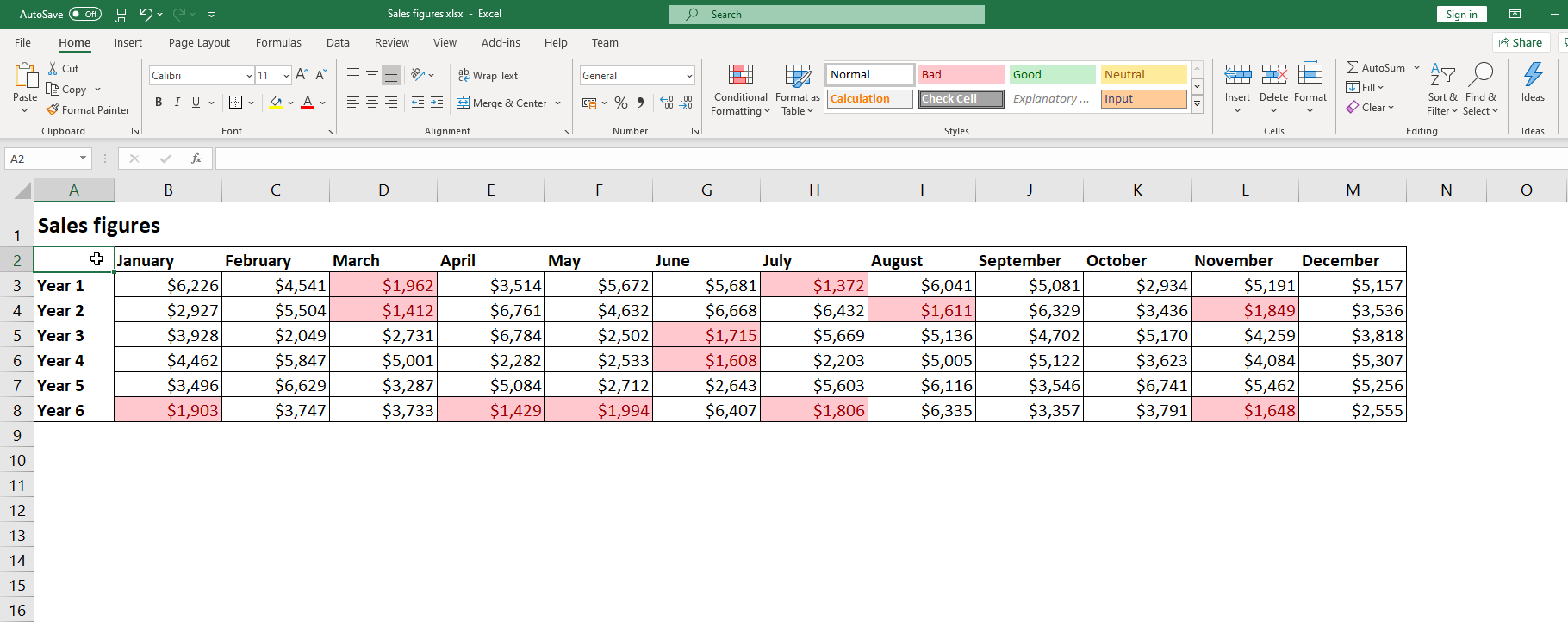
2. Conditional Formatting
Conditional formatting offers a variety of formatting options for data. You can shade cells, find duplicates, delete duplicates, and other functions for specific conditions. Conditional formatting can come in handy when polishing your data for presentations. As a marketer, you must highlight relevant data and interestingly present your findings.
For example, finding duplicates in sales data can show you repeat customers loyal to your brand. You can remove duplicate data that affects your results, or you can use different colors to identify performing entities from none performing entities. You can play around with conditional formatting until you find functions that suit you.
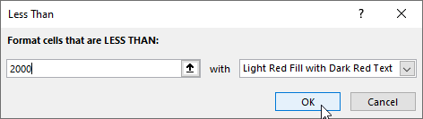
Here we’re showing every value smaller than 2000 in red:
3. Charts and Graphs
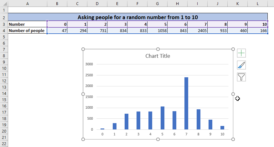
Visual presentation of data is a powerful tool that every marketer should use. Microsoft excel has made it simple to create graphs and charts. You do not need to use a formula to present your data in a graph or chart.
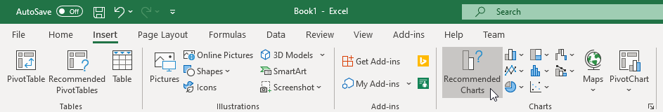
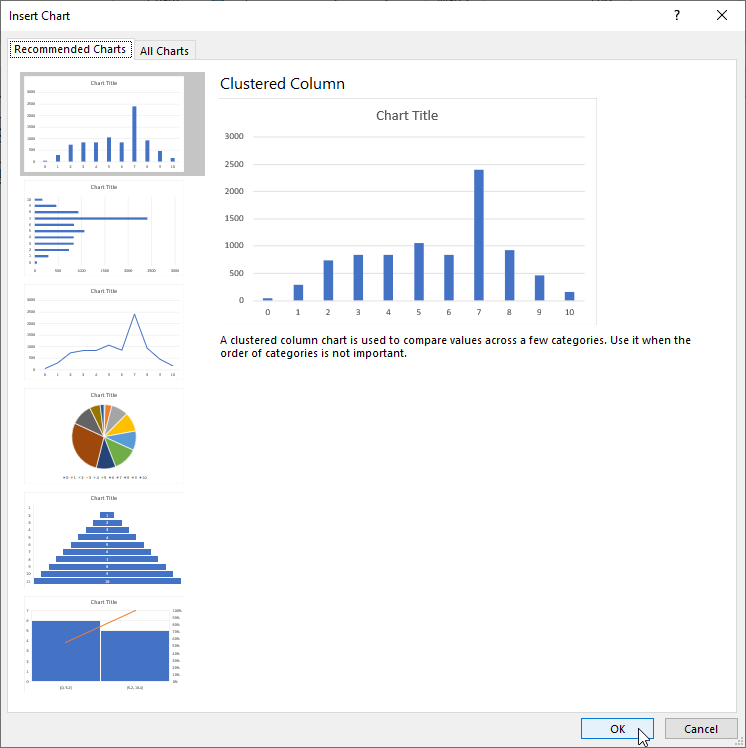
However, you do need to know which data should be shown in the charts and graphs. Additionally, because Excel has various types of charts, you have to pick the one that fits your needs. You can choose to create charts and graphs on a trial and error basis until you find a suitable representation. Alternatively, you can let Excel help you by choosing the Recommended Charts, like shown below:
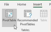
4. Pivot Tables
Pivot Tables allow you to present a large amount of data in reasonably sized tables. Pivot Tables organize big complex matter into condensed lists and tables ready for consumption. They are often used to help make decisions.
Pivot tables can be a little intimidating for amateurs because there are almost infinite ways to organize the data. However, once you learn and understand how to use them, it will become the first choice for sensibly organizing data.
5. VLOOKUP
VLOOKUP is a wonderful function that allows you to look up information in a spreadsheet or a workbook. It is a useful tool for marketers who deal with a large amount of data. It can be hard to find certain information when dealing with a workbook.
You can collate data from various spreadsheets and workbooks for reporting purposes. Imagine pulling the relevant information from different places to create sensible reports. It significantly reduces the time it takes to pull data and produce reports.
Once you understand this function, you can forget about the days you would go through hundreds of excel files looking for information.
For a quick lesson on VLOOKUP, check out our Youtube tutorial explaining VLOOKUP in 2 minutes.
6. Trendlines
Creating graphs is one thing, but identifying trends from graphs is an awesome tool all marketers can benefit from using. Trend lines will help you to see the trends from the data you have on your spreadsheets. You can identify upcoming trends and follow up to see whether it is a viable marketing avenue.
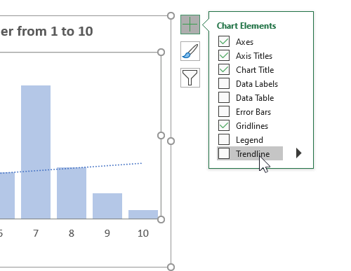
The biggest advantage of trend lines is that Excel can identify the best-fit trend line from the data you have. You can identify many things, including sales, buyer preferences, marketing performance, and even future trends from marketing data.
Wouldn’t it be useful to know when the results of your marketing effort begin to go down? You can change your marketing campaigns before it is too late.
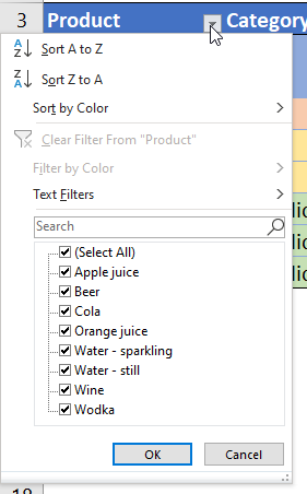
7. Filter
The filter option is excellent when you want to understand the data you have. You can filter data depending on columns and see the entities that meet your filter criteria.
The filter option is fantastic for marketers who have to provide different kinds of reports from their data. You can filter all the male customers in your data and create a chart. You can also segment the data in terms of figures in the columns. Filtering data can help you understand different aspects of your data fast without the use of any formulas.
To filter data, first make sure you have converted the data to a table. To do so, select any cell containing your data. Then, go to the Insert tab on the Ribbon and click on Table. In the popup that opens, select whether your table has headers and click on OK. You now have a table.
Once you’ve created the table, you can filter items using the arrow icons next to the headers of the table:
How Can You Learn Excel?
Most marketers do not think that they need to enroll in Excel classes. However, data analysis can become the secret weapon of your marketing strategies.
Wouldn’t you want to know the next emerging trends? Wouldn’t it be awesome if you could predict the product that clients are going to buy in large quantities? Understanding the best Excel tricks for marketers will help you bring your A-game at work. You will be able to allocate your marketing budget to campaigns that will have high returns.
If you’re interested in getting good at Excel, we can help. A good first step is to [thrive_2step id=’2112′]sign up for the newsletter[/thrive_2step]. When you do, you’ll also get the Free Excel Cheat Sheet. It can boost your productivity and help you take the first step into becoming a confident Excel user.